
Electronic Materials Office
A glowing ember in a gallery decorated with charcoal
The Electronic Materials Office is a late-night workshop: a matte jet-black canvas, a single glowing orange ember, and a typeface that whispers rather than declares. The interface treats each screen like a darkened studio—photographs of the keyboard are the only real light source, and the UI obeys it. Headlines, set in 200-weight GT-Flexa, float in vast negative space; body copy is intentionally small and humanistic (Times). Color is measured: pure white for type, muted purple (#9e9eff) for links, and a single orange (#f45500) call to action on the page that glows with its own 30px glow. Components fit tightly within a 20px radius, borders are barely noticeable at #9d9d9d, and the only shadows in the system are two colored halos around the primary action.
A full-width, charcoal canvas with centered, maximum-width content (~1200px). The main screen begins with a 20px-radius media card containing a product video, occupying roughly 80% of the viewport width, immediately followed by a multi-line GT-Flexa 200 headline that wraps to nearly the full content width. Section rhythm: a single product description section in Tobias-style all-caps, followed by a 2x2 grid (on desktop) of product description cards. Cards use 1px #9d9d9d borders and 24px gutters between them. Generous vertical breathing—sections are separated by 48–128px of charcoal negative space rather than dividers. Navigation is a single, transparent panel anchored at the top, with a cluster of hidden links and a single Ember call-to-action. No sidebar, no mega-menu, no secondary navigation.
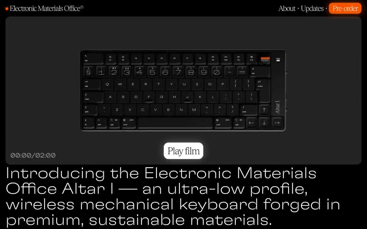
The images are for product demonstration purposes only—a close-up macro shot of the Altar I keyboard against a completely black background, with a backlight from above, causing the case to glow and the keycaps to reflect light around the edges. No lifestyle, no human hands, no environmental context. The imagery is high-contrast and dark; the only color outside the monochrome palette is the orange power switch on the keyboard itself, which echoes the Ember Orange call-to-action. Images are square or 16:9, always placed in cards with a 20px radius and extending beyond the edges of the card (there is no padding around the photo, and the text is below the edge). Icon style: the only iconography is a small filled circle (●) before the logo—a single orange dot, ~6px thick.
Palette
Brand
- Ember Orange
#f45500— The primary action button with a fill is the only chromatic surface in the UI, always accompanied by a 30px orange halo, making it glow like a filament; the 30px outer glow on the primary call button duplicates the Ember Orange hexagon symbol, but exists as a shadow rather than a fill, making the button appear illuminated from within.
Neutral
- Studio Charcoal
#202020— The canvas and cardboard surfaces are like the floor of a dark gallery, never completely black, so that the eye can rest on the soft edges. - Bone White
#ffffff— Main text, thin borders on images, and a rare inverted surface. The entire font hierarchy is maintained independently. - Ash Gray
#9d9d9d— Muted text, subtle card borders, and inactive captions are the only mid-gray in the color scheme, used when white is too loud. - Mid Felt
#eaeaea— A light surface wash for inverted panels or modal grids - a shade of white that sits between beige and dark canvas. - Carbon
#000000— The most striking accent is for icon strokes and contrasting frames where the charcoal canvas is too light to hold its shape well. - Lavender Link
#9e9eff— The color of the embedded link and the outline of the additional action frame are a muted, cool contrast to the warm orange, ensuring the actions are legible against the charcoal background.
Typography
from 16 to 86px · 8 steps
- GT-Flexa — replacement: Inter (200/400) or Manrope (200/400) · outlines 200, 400 · The primary font for headings and decorative elements. The 200 weight allows for every heading above 24px—this is a signature style: at 68px and 86px, the letters seem to dissolve into the atmosphere rather than shout. The 400 weight is suitable for subheadings and card captions, where they are barely audible. Line spacing is reduced to 1.0 at the largest sizes, so the decorative font stacks on top of one another like a column of air.
- Tobias-light — replacement: Söhne Buch or Inter Tight · outlines 400 · A secondary typography style for section headings and the footer logo. It's used one step below GT-Flexa 200 to create a tonal contrast—Tobias has a more architectural, expressive feel, while GT-Flexa is more atmospheric. The negative letter spacing narrows the wide proportions of Tobias Light.
- Times — replacement: Source Serif 4 or PT Serif · outlines 400 · The body text and heading paragraphs are a deliberate counterpoint to the geometric, decorative fonts, using serifs. The serifs add warmth and editorial authority to the product descriptions without exceeding the size of the body text.
Intervals and form
| Purpose | Meaning |
|---|---|
| Density | dense |
| Basic step | 4-8px |
| Button radius | 20px |
| Card radius | 20px |
| Shadows | no - borders instead of shadows |
| Between sections | 48-128px |
| Page width | 1200px |
AI will build your website in Electronic Materials Office style and fill it
- Fill with products and posts via the link - Instagram, TikTok, Facebook.
- Transfer content from your old site—just specify the address.
- Modern design on the best engine: React ( Next.js) with server rendering and SEO optimization out of the box.
- Fully automated SEO optimization for search results and neural network recommendations.
Similar styles
- OFFFICE : — a noir gallery engulfed in monolithic font
- Bibliothèque — A black cube-shaped gallery under a spotlight – a lone illuminated plate in a vast, dark hall
- 21 TSI — A crimson void, a single silhouette – a high fashion editorial where the user interface dissolves into the atmosphere
- Structured — Renaissance gallery on plasticine-like paper
- CHAIBOY — A black gallery wall with a single backlit photograph
- Holiday 100 — A gallery of gifts at midnight—a serif headline serves as a spotlight, a dark canvas as a velvet wall, and each product image hangs like a carefully selected frame.
- Apple (España) — The museum gallery, in soft daylight, is a single, captivating, weightless white space, with each exhibit illuminated by a spotlight against a lightly tinted wall.
- Analogue — Black gallery display case – goods hover in the void
- Apple (España) — The Obsidian Gallery showcase is a dark exhibition hall where a single titanium object glows against a pitch-black background.
- Studio Oker — A darkened gallery with scarlet accents—a portfolio room lined with black walls, where white letters seem to float and a single red whisper cuts through the silence.
- 099 SUPPLY — A gallery wall filled with black and white objects
- Retool — A warm obsidian workshop - a surface for precision tools, lit by smoldering embers, where everything is created