
Duolingo
Playful class mascot on white paper
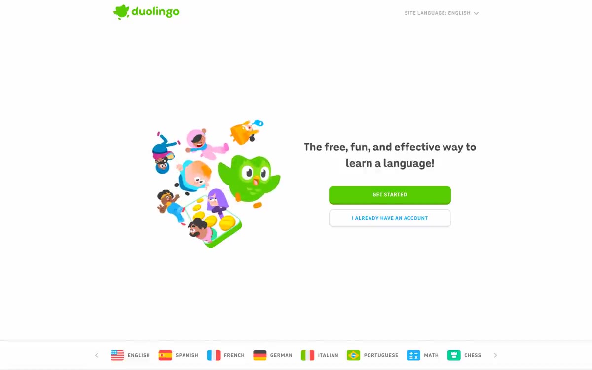
Duolingo's interface is designed like a children's picture book: a white paper canvas, plump, rounded font, and a single, rich green color that immediately evokes the "correct answer." The main text is a soothing mid-gray tones, allowing the green and its accent blue to do all the emotional work—green for progress and headings, blue for clickable links and additional actions. Components are shaped like pills or chunky, rounded corners with thick black or colored borders, making each button feel more like a sticker stuck to the page than a flat UI control.
Sections occupy the full width of the page and are arranged vertically in a single column, each approximately 800 pixels high. The maximum content width is approximately 1 pixel centered. Text on the left and illustrations on the right alternate, providing ample vertical space (80 pixels between sections). There are no grid cards or multi-column layouts—each section is a single text block paired with a single illustration. Navigation is a minimalist top bar with a logo and language selector, which appears as a fixed bar between sections. The footer is a green stripe spanning the entire width of the page. The rhythm is editorial: heading, paragraph, call to action, illustration, repetition.
The book's illustrative language features flat, two-dimensional mascot characters (Duet the owl and various human figures) with rounded geometric shapes, bold black outlines, and a complementary color palette of pink, purple, yellow, orange, and blue that never appears in the interface itself. The illustrations are positioned next to the text on the right side of each section, against a pure white background, without containers or backgrounds. There are no photographs—the characters serve as the visual content. The iconography uses thick outlines, consistent with the style of the mascots. Image density is moderate: each section features one large illustration of the character, with the rest of the page devoted to typography and white space.
Palette
Brand
- Eager Green
#58cc02— Green is used to highlight links, tags, and short phrases. It should not be used as the primary color for calls to action. - Storybook Green
#d7ffb8— Soft highlights on light surfaces, subtle background tones behind the navigation labels in the footer.
Neutral
- Spark Blue
#1cb0f6— Blue is used to highlight links, tags, and short phrases. It should not be used as the primary color for calls to action. - Fresh Leaf
#a5ed6e— Green is used to highlight links, tags, and short phrases. It should not be used as the primary color for calls to action. - Night Ink
#000437— Links, tags, and short highlighted phrases are highlighted in purple. - Paper White
#ffffff— Page canvas, cardboard surfaces, button text on green/dark background. - Charcoal
#4b4b4b— Hero Headers and Body Text - Universal dark text that allows colored headlines to stand out. - Pencil Gray
#777777— The main paragraphs of text are highlighted with inconspicuous letters, and secondary descriptive text recedes into the background, so that the colored elements come to the fore.
Typography
from 13 to 64px · 7 steps
- feather — replacement: Inter · outlines 700 · Section headings, such as "Free. Fun. Effective" and "Duolingo English Test," are displayed using a custom rounded font, giving the brand its playful, friendly, mascot-like style. Replace with "Feather Bold" or "Nunito Black" in the appropriate weight. Letter spacing: -0.0200em
- duolingo-sans — replacement: Inter · outlines 500 · Main paragraphs and navigation links at 17px/500—a geometric sans-serif font that remains legible, allowing the 700 line weight to highlight important points. Replace with 'DIN Next', 'Inter', or 'Nunito Sans'.
- duolingo-sans — replacement: Inter · outlines 700 · All weight-700 values are used: capital letters in navigation labels are 15px (ls 0.0530em), subheadings are 19px and 32px, and link emphasis is 13px. The same font as the main text—the visual difference is in the weight, not the font change. Letter spacing: 0.0530em for capital letters in navigation labels.
Intervals and form
| Purpose | Meaning |
|---|---|
| Density | dense |
| Basic step | 12px |
| Button radius | 12px |
| Card radius | 12px |
| Shadows | no - borders instead of shadows |
| Between sections | 80-120px |
| Page width | 1200px |
AI will build your website in Duolingo style and fill it
- Fill with products and posts via the link - Instagram, TikTok, Facebook.
- Transfer content from your old site—just specify the address.
- Modern design on the best engine: React ( Next.js) with server rendering and SEO optimization out of the box.
- Fully automated SEO optimization for search results and neural network recommendations.
Similar styles
- Family — A spread from a fairy tale on cream parchment
- Say Briefly — Creative agency sketchbook on cream paper
- Flying Papers — Confession on a Saturday Morning Cartoon
- Portrait — A wall of memories, captured in Polaroids on cream-colored paper. A bright, cream-colored scrapbook where dark blue ink serves as the only text, the only structure lines, and the only frame color—with a single hand-drawn rainbow that appears once, on the "Register" button and on the italicized word "forever," and never again.
- Karl — A 3D pop-up book style diorama on a sunny day
- Navigate — A large set of stickers attached to a board: large grotesque font, all in the form of tablets and five multi-colored icons, repeating like a logo
- Monte — Morning on the coast with a rusty tint
- MotherDuck — Terminal coded with colored pencils on cream paper
- Wise Design — A neon market stall on a global street—a bright green sign screaming through the crowded marketplace, while behind it, a polished product user interface appears discreetly.
- Hatch — A hand-drawn, samizdat-style design mixed with pastel candy bowls. A creamy paper canvas adorned with mint accents, confetti dots, and pill-shaped calls to action, where a large, bold serif font hints at fun, and a blue mascot winks in the corner.
- Superr — A warm school notebook in the soft afternoon light. A cream-colored page, an orange marker without a cap, and a stack of laminated name stickers waiting to be peeled off.
- Mews — A hospitality control center at dawn, drenched in pink. A white-walled, sunlit workspace where bold black type, warm cream cards, and a single hot pink action button define each screen—a playful confidence rather than corporate restraint.