
Dala
a constellation hovering on black velvet
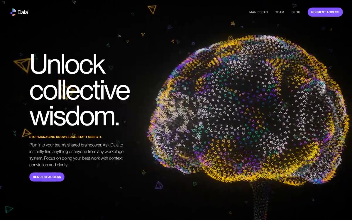
Dala presents a dark space where black voids meet a single vibrant purple accent, interrupted by amber sparkles. The typography is monolithic and weightless—PPNeueMontreal, a 400-weight typeface, dominates each headline at an oversized size (78–113px) with aggressive negative letter spacing, making the headlines feel more sculptural than informative. The visual center is a constellation of tiny, multicolored triangular particles, forming an organic brain shape, which serves as the brand's signature gesture: knowledge visualized as distributed intelligence rather than hierarchical data. The layout follows a spacious two-column rhythm—oversized, left-aligned headlines paired with expansive body copy, floating against a clean black background without panels, frames, or cards. The components are deliberately reduced to their most essential form: a single purple pill button, hidden text links, and large text blocks.
Full-width sections are laid out on a pure black canvas, with a maximum content width of ~1280px centered. The main section features an asymmetrical two-column layout: a large left-aligned headline (113px) with the main text and call-to-action on the left half, while a "particle brain" visualization occupies the right half at an enormous scale. Subsequent sections alternate between two columns (visual left/text right, then text left/visual right), creating a zig-zag reading rhythm. The gutters between sections are generous (60–120px vertical). There are no card grids, pricing tables, or multi-column feature descriptions—content is arranged in spacious two-column text-visual blocks. Navigation is a minimalist transparent top bar, without a sidebar or mega-menu. The density of elements is extremely high - one or two elements per viewport, never overloaded with information.
The visual design is entirely procedural and abstract—no photographs except for team portraits. The brand visual identity is a dense cloud of thousands of tiny, outlined triangular particles rendered in a full, vibrant spectrum (violet, amber, turquoise, purple, blue), forming an organic brain/neuron shape. This particle field is animated and serves both as the main image and as a brand identity element. Surrounding particles, at a lower density, move across the page background. The triangles have outlines, a 1–2px line weight, sharp edges, and rich, chromatic colors—never grayscale. Team portraits are displayed as large, rounded rectangles (124px radius) with no borders or overlaps. No product screenshots, no lifestyle photos, no 3D renders—the particle system IS the visual brand.
Palette
Brand
- Electric Iris
#8052ff— The main action buttons, logo, and brand accents are a single, rich purple color, signaling interactivity and brand identity against a black background.
Neutral
- Void
#000000— The page canvas, the section backgrounds, the negative space—the dominant surface is pure black, not dark gray, creating a void that allows chromatic accents to float freely. - Bone White
#ffffff— Headings, body text, icon fill, active navigation state - the only typographic color that provides maximum hierarchy on a black background. - Ash Gray
#9a9a9a— Subdued navigation text, translucent link color, and additional labels are hidden behind the main text without becoming invisible. - Silver Mist
#bdbdbd— Additional text, information at the caption level - the quietest and most readable gray color, to support context. - Saffron Spark
#ffb829— Highlighting text, emphasizing links, and drawing attention with punctuation marks—warm yellow against a purple background creates chromatic tension for the brand. - Deep Verdant
#15846e— Secondary surface tinting, a gradient logo stop, manifests itself as a darker edge of the brand gradient and in the form of barely noticeable accent transitions.
Typography
from 12 to 113px · 10 steps
- PPNeueMontreal — replacement: Inter · outlines 200, 400, 600, 700 · A consistent font is used across all UI contexts. Headings in display sizes (78–113px) use a 400 weight with -0.04em letter spacing—the same weight as the body copy, but the larger scale creates hierarchy. A 200 weight (an ultra-light font) is reserved for 18px body copy; this is a brand-specific decision: most AI/SaaS sites use 400 for body copy, but Dala reduces the weight to keep paragraphs airy and non-aggressive. A 600 weight with 14px letter spacing, 0.025em letter spacing, and all-caps is used for navigation and small headings. The use of 400 for both 113px headings and 15px body copy is unusual—it suggests the brand relies on scale, not weight, to create hierarchy.
Intervals and form
| Purpose | Meaning |
|---|---|
| Density | dense |
| Basic step | 6-18px |
| Button radius | 24px |
| Card radius | 24px |
| Shadows | no - borders instead of shadows |
| Between sections | 60-120px |
| Page width | 1280px |
AI will build your website in Dala style and fill it
- Fill with products and posts via the link - Instagram, TikTok, Facebook.
- Transfer content from your old site—just specify the address.
- Modern design on the best engine: React ( Next.js) with server rendering and SEO optimization out of the box.
- Fully automated SEO optimization for search results and neural network recommendations.
Similar styles
- Linear — midnight precision instrument
- Resend — black velvet with purple neon color
- Ciridae — An empty room with the pulsation of smoldering embers - an almost black cathedral where the only warm sound is a thin line of rust, and every surface is defined by fine lines rather than shadow.
- Dovetail — A blueprint under a black moon—barely visible graph lines, white font, one purple sparkle
- Neon — A server room after dark. Pure darkness, where the only light comes from data and user interactions.
- Discord — The game world is hidden behind a pop-up chat window - each section is a self-contained environment with its own lighting and set of characters
- Aaru — Particle Field Observatory at Midnight
- Atlas Card — The Midnight Vault, with its single sapphire ray, is a pitch-black expanse where the only thing that matters is the deep electric blue.
- Midjourney — A bioluminescent terminal in the deep ocean. A deep-sea world where intelligence visually generates itself in ASCII streams, and controls appear as faintly glowing patterns.
- Checkly — Deep Orbit Mission Control Center
- Krea — gallery noir at midnight
- Wope — Wope is a purple horizon interface. Imagine a dark observatory table with a purple light beaming from beneath the glass.