
Column
a dark blue ledger under the cool dawn
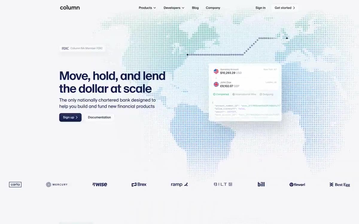
Column uses a deep, institutional navy blue on a near-white background: the page feels like a robust banking product surface first and a developer playground second. The brand color isn't a single one, but a coordinated pair—navy blue #111a4a for serious structure, mint green #44b48b for data and code—with a single warm orange (#ec652b) reserved for high-intensity accent surfaces like the Brex card. The typography is dominated by SuisseIntl, a geometric sans serif used across the entire weight range from 300 (links) to 600 (display), giving the system a refined, editorial style that most fintech companies lack. Cards float on large white surfaces with subtle, layered shadows; most interface elements are flat, with depth appearing only where the card should feel like a physical object (transaction widgets, product mockups). The code and financial data are presented in monochrome, seafoam-colored—a visual signal that this is a bank built by engineers for engineers.
The page structure is full-width, centered with wide side margins (64–15 cm on desktop). The main screen is a split layout: the headline and calls to action are left-aligned at 25 cm, while a floating transaction widget is positioned on the right at 55 cm against a halftone map background. Below the main screen, sections alternate between white (4 cm) and light canvas (5 cm) with 6 cm vertical gutters. Content is arranged according to a single 6-column grid: text blocks occupy 4 columns (7 cm), image/product cards occupy 5–6 columns, with a deliberate offset from the grid. Sections describing features use a 2-column layout: text on the left, product on the right. The trust statistics section is divided into a 4-column grid across the full width of the page. Customer logos are located in a single centered row with 48px gutters. The footer has a compact two-column layout. The navigation is a fixed, 62px-tall, transparent top bar over the main screen with a blurred background that fades to white as you scroll. There's no sidebar or mega-menu—the dropdowns are simple arrow-style menus.
The visual style is minimalist and functional—Column completely avoids stock photography. The visual language is built on three sources: (1) SVG data illustrations, specifically a dotted halftone world map, rendered with a gradient from indigo to orange to turquoise, creating an atmosphere of global scale behind the main element; (2) product card layouts—floating widgets displaying account balances, transfer details, and JSON code snippets in white cards with dramatic shadows; (3) chart visualizations—turquoise candlestick or bar charts with thin connecting lines used in the trust/statistics section. The halftone map is a signature visual element—its gradient transitions from #d65620 (orange) through violet, blue, azure, turquoise, and yellow, creating a spectrum that unites the entire brand palette on a single decorative surface. The icons have a uniform outline thickness of 1.5–2px in the #232730 or #a9acb6 variants, with a fill for active states. No lifestyle photos, no abstract 3D renders—the restraint is intentional to focus attention on the product and data.
Palette
Brand
- Indigo Navy
#111a4a— The primary brand color is used for filled calls to action, active navigation states, the header, and the logo. The deep violet-blue color gives the site a solid yet rich black hue; paired with white text, it creates the most assertive button on the site. - Seafoam 600
#44b48b— Code and data color is the brand color for JSON keys, identifiers, and financial values in code snippets. It is also used for data points in charts and growth visualizations. - Seafoam 700
#167e6c— A darker shade of seafoam for the outline, chart lines, and icon accents within the data context. This anchors the seafoam scale against the darker background. - Seafoam 400
#94efb7— The highlighted code fragment contains string values, URLs, and API endpoints within code blocks. The lightest seafoam color reads as a monospaced font with a greenish tint. - Deep Sea
#023247— The decorative outline and accent color of the chart is a rich turquoise color used in SVG illustrations and data visualizations, along with the seafoam color scale.
Neutral
- Midnight Ink
#011821— Dark surface and highlighted text – product card background, high-contrast main text. Closer to gray with a cool blue-green tint; used as a base for dark mode when a section needs to be inverted. - Slate Ink
#3b3e47— The secondary title and main text are a little warmer than Midnight Ink, used where pure black would seem too harsh on the light canvas. - Steel
#7c7f88— The main text and link text are dominated by a muted color (used 245 times in the main text). A neutral gray-blue color that is perceived as calm, never a washed-out image. - Fog
#a9acb6— Icon outlines, tertiary borders, and placeholder text. A medium gray color that separates the text without competing with it. - Mist
#cbcccf— The main text—signatures, disclaimers, and small print—is legible on a white background, but visually less noticeable. - Silver Lining
#e3e4e8— Card borders, input field borders, dividing lines. This structural, subtle color is used where two surfaces need to be separated without shadows.
Typography
from 10 to 60px · 10 steps
- SuisseIntl — replacement: Inter · outlines 300, 400, 500, 600 · Primary font – used for all headings, body text, buttons, navigation, links, and card text. The unique geometric sans serif gives Column a distinctive editorial style, setting it apart from other fintech companies working exclusively with Inter-only. The weight is 600 at 52–60px for headings, 500 for subheadings, 400 for body text, and 300 for low-emphasis links.
- SuisseIntlMono — replacement: JetBrains Mono · outlines 400 · A monospaced font similar to SuisseIntl, used for technical labels, API identifiers, and embedded data in UI elements. It maintains the same proportions as SuisseIntl, so monospaced and proportional text align correctly in mixed contexts.
- SFMono — replacement: Fira Code · outlines 400 · Code snippet display – displayed in JSON examples and API documentation blocks. A seafoam shade is used to visually distinguish code from UI text.
Intervals and form
| Purpose | Meaning |
|---|---|
| Density | average |
| Basic step | 8px |
| Button radius | 8px |
| Card radius | 8px |
| Shadows | no - borders instead of shadows |
| Between sections | 72px |
| Page width | 1200px |
AI will build your website in Column style and fill it
- Fill with products and posts via the link - Instagram, TikTok, Facebook.
- Transfer content from your old site—just specify the address.
- Modern design on the best engine: React ( Next.js) with server rendering and SEO optimization out of the box.
- Fully automated SEO optimization for search results and neural network recommendations.
Similar styles
- dope.security — Midnight terminal with purple beacons
- Leonardo — An inverted editorial gallery. A black-walled museum where purple headlines act as wall installations, and AI-generated portraits hang in a dense grid below.
- VEED — White gallery wall with neon green light buttons
- Craft Docs — A digital collage for scrapbooking. The design resembles a thoughtful, tactile scrapbook, where structured digital notes combine with soft, organic textures.
- Letter — A private gallery featuring shimmering artifacts from storage. A black-walled exhibition space where serifed headlines float above chrome sculptures on the gallery's tinted walls.
- Railway — The Cosmic Midnight Express. A calm, thrilling journey through dark, starlit space, guided by clear signals.
- Garden Eight — A monumental editorial on cream-colored paper. The 215px serif headline sits alone on warm parchment, surrounded by floating sculptural forms and negative space reminiscent of sea air—the page feels more like the cover of an art monograph than a dashboard.
- Steep — Analysis of Serif Fonts on Warm Paper
- ElevenLabs — A photo essay in warm cream tones with subtle headlines. A Bauhaus-style notebook—eggshell-colored paper, black ink, and a single purple and orange accent for product display.
- Awesomic — Editorial zinc mesh with orange punctuation marks reminiscent of confetti
- Monad — editorial technical journal on warm parchment
- AI for Business — Brutalist editorial showroom in warm grey tones