
ARTU
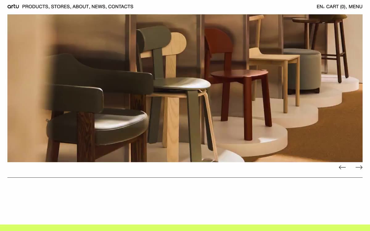
Gallery wall on white paper. ARTU treats the viewing space like a museum spread—large-scale product photos, subtle markings, and a single touch of lime at the bottom that completes the composition.
ARTU functions like a furniture gallery in a browser format: a single, custom-made, neo-grotesque typeface in a single color, a stark white canvas, product photos that fill the entire viewport, and a near-total absence of visible interface elements. The discipline is extreme—one color, one font family, two surface colors—and negative space serves the same purpose as shadows and gradients elsewhere. Color is used surgically: a rich lime green (#d7ff66) accents the page only at the bottom as a final cue, while a rich red (#ff1313) appears as thin border lines and icon strokes—deliberately lacking contrast, it functions as a graphic rhythm rather than information. As a result, it feels less like a commercial website and more like a spread from an art book: the products are the layout, the layout is the empty space, and the interface is a thin, black line of all-caps navigation in the top corner.
A single-column, single-page image gallery. The first screen displays a full-width splash page photo with a thin top navigation bar (logo on the left, menu items separated by commas, language/cart/menu on the right) and minimal carousel arrows in the lower-right corner of the image. Below the splash page photo is a thin black dividing line, followed by a spacious image grid, asymmetrically combining different scales—small thumbnails, medium squares, and large portrait images of varying widths (approximately 25-1/2 pages), all on a white background, with no gaps wider than 2/2. The page ends with a full-width stripe at the bottom of the page, in lime green (approximately 24-4). Overall, the impression is of a printed catalog—the typography is in the margins, the photo occupies the center, and the lime green stripe completes the composition.
Photography is the entire visual identity. Full-size, high-quality shots of furniture and chairs, taken with warm interior lighting and natural shadows on white or wood floors. The first main image fills the entire screen from edge to edge. The gallery section uses an asymmetrical editorial layout, with images of varying scales and aspect ratios (1:1, 3:4, 2:3) arranged with wide white spaces, without captions or overlays. There are no illustrations, no icons except a few thin red strokes, no abstract graphics, and no lifestyle photography—the subject is always the subject, captured in context, never decorated.
Palette
Neutral
- Canvas White
#ffffff— The page background, the card surface, the graphic image—the entire site is placed on a pure white background. - Ink Black
#000000— All text, thin border lines, navigation, link underlines, image frames - the only structural color. - Terminal Lime
#d7ff66— A stripe in the footer, surface highlighting, and a final accent – a rich green color that marks the page border like a colored border on a gallery wall. - Signal Red
#ff1313— Decorative border lines, icon outlines, and thin lines in editorial layouts are used as graphic punctuation marks with barely legible contrast, but never as body text.
Typography
from 18 to 32px · 4 steps
- HelveticaNeuePro — replacement: Neue Haas Grotesk · outlines 400 · A versatile font family for navigation, body copy, headings, input fields, and footer - a single font on the site (400), set in all caps in the navigation and footer, with positive letter spacing of 0.0140em–0.0240em, giving the single font a mechanical, catalog-like rhythm.
Intervals and form
| Purpose | Meaning |
|---|---|
| Density | dense |
| Basic step | 11px |
| Button radius | 0px |
| Card radius | 0px |
| Shadows | no - borders instead of shadows |
| Between sections | 32px |
| Page width | 1440px |
AI will build your website in ARTU style and fill it
- Fill with products and posts via the link - Instagram, TikTok, Facebook.
- Transfer content from your old site—just specify the address.
- Modern design on the best engine: React ( Next.js) with server rendering and SEO optimization out of the box.
- Fully automated SEO optimization for search results and neural network recommendations.
Similar styles
- Apple (España) — The museum gallery, in soft daylight, is a single, captivating, weightless white space, with each exhibit illuminated by a spotlight against a lightly tinted wall.
- Apple (España) — The White Museum Gallery at noon
- Structured — Renaissance gallery on plasticine-like paper
- MindMarket — A cozy fairytale book on cream paper - a friendly editorial canvas where large Inter headlines and cut-out paper characters coexist on a sun-drenched, sticker-soft surface.
- Airbnb — A quiet white gallery wall with a single coral red bookmark
- Lamborghini — Black body color in the showroom, under the spotlights - one yellow car
- Apple (España) — The Obsidian Gallery showcase is a dark exhibition hall where a single titanium object glows against a pitch-black background.
- 099 SUPPLY — A gallery wall filled with black and white objects
- Apple (España) — white gallery display case
- Custo — A gunmetal-colored gallery with a monolithic font. A showroom in muted gray-green tones, where a single dark object and 57px font speak for themselves.
- Silencio — A white room with floating artifacts. A gallery display made of warm paper, where each element occupies its place against a background of negative volume, and the silence is an intentional design decision.
- Oakâme — A sun-drenched Provençal workshop carved from warm stone