
Apple
A white room with a single blue switch
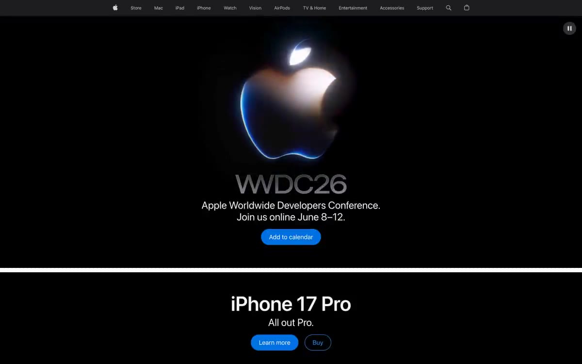
Apple's design is a model of restraint: a nearly white canvas, ample white space, and a single, vibrant blue accent that makes every action feel deliberate. The primary focus is typography—SF Pro, with negative letter spacing that decreases with increasing size, lending headlines an architectural clarity without being overly heavy. The product IS the design: large product photos and lifestyle images dominate, while chrome elements recede into thin frames, translucent navigation, and subtle lines. Sections alternate against a light gray background with full-color blocks for promotional materials, creating rhythm through changes in scale rather than decorative elements.
The page layout is a full-width page with no fixed maximum container width—sections stretch edge to edge, with text blocks centered within at approximately 980px. The navigation is a single, fixed global bar with an additional subfolder for each product that appears on scroll. The main layout is always centered: a large product name, a single-line tagline, two pill buttons, then a product image that fills the remaining viewport. Sections are stacked vertically with a generous vertical rhythm (64px+ between sections), alternating #f5f5f7 and colored backgrounds. The bottom page is a single horizontal row of full-width service cards (Apple TV+, Fitness+, Music, Arcade), each a photo block with overlay text and a pill button. No sidebars, no multi-column content layouts, no asymmetrical compositions—everything is centered, stacked, and symmetrical.
Photography is the dominant visual language. Product photos are taken against a pure white or soft gray background, without any context—the device IS the star, isolated and illuminated. Lifestyle photos are displayed in full-width banners, often with tightly cropped objects. Color gradients (pastel blue, pink, green) serve as a backdrop for the product sections, not as decoration. The iconography is minimalist and line-based, 1-2px thick, in the same grayscale as the text. No illustrations, no abstract graphics, no 3D renderings, except for the product photos themselves.
Palette
Brand
- Apple Blue
#0071e3— Filled action buttons, selected states - the only interactive chromatic color used sparingly to make every appearance meaningful. - Link Blue
#0066cc— Highlighted action borders, embedded links - a more saturated color than Apple Blue is used where a filled tablet would be too flashy. - Signal Blue
#2997ff— Decorative frames, image outlines, icon borders - the lightest blue color in the system, used for atmosphere rather than for user interaction.
Neutral
- Carbon
#1d1d1f— The main text, heading borders, navigation lines, card borders - the predominant ink color is almost black with a slight hint of warmth. - Frost
#f5f5f7— The page canvas, main text background, and footer surface are Apple's signature light gray, a little cooler than pure white. - Ice
#f4f8fb— Expressive surface fills, subtle hues, button text on a dark background—a subtle blue hue that enlivens the section without making it stand out. - Smoke
#333333— Secondary text, navigation fill, button borders - A versatile neutral color for borders and icons that need more punch than a medium gray. - Graphite
#474747— Navigation text, navigation borders, link borders - occupies an intermediate position between Carbon and Smoke in the element hierarchy. - Ash
#707070— Footer text, list borders, navigation borders, muted body text - A medium gray for content that needs to be present but not prominent.
Typography
from 12 to 56px · 8 steps
- SF Pro Display — replacement: Inter · outlines 400, 600, 700 · Headlines and large text—40px+ sizes use a display format for a narrower aperture and stronger negative tracking; 700 is reserved for advertising layouts, and 400 is for product names in editorial content.
- SF Pro Text — replacement: Inter · outlines 300, 400, 600 · Body text, navigation, buttons, subheadings — working font; 400 for body text, 300 for subheadings and qualified labels, 600 for navigation elements and button text; negative letter spacing decreases proportionally to the size (from -0.022em to 12px to -0.01em to 44px).
Intervals and form
| Purpose | Meaning |
|---|---|
| Density | average |
| Basic step | 12px |
| Button radius | 980px |
| Card radius | 8px |
| Shadows | no - borders instead of shadows |
| Between sections | 64px |
| Page width | 1440px |
AI will build your website in Apple style and fill it
- Fill with products and posts via the link - Instagram, TikTok, Facebook.
- Transfer content from your old site—just specify the address.
- Modern design on the best engine: React ( Next.js) with server rendering and SEO optimization out of the box.
- Fully automated SEO optimization for search results and neural network recommendations.
Similar styles
- Ui — clinical plan on matte paper
- ElevenLabs — A photo essay in warm cream tones with subtle headlines. A Bauhaus-style notebook—eggshell-colored paper, black ink, and a single purple and orange accent for product display.
- monopo saigon — A liquid, iridescent glow behind the editorial silence—a monochrome editorial gallery floating on molten light
- Awesomic — Editorial zinc mesh with orange punctuation marks reminiscent of confetti
- Monad — editorial technical journal on warm parchment
- Dub — Link's matte rice paper control panel
- Seline Analytics — A quiet analytical table on warm paper
- Ventriloc — An editorial observatory of data on warm paper - a single orange ember highlighting the monochrome precision
- Duolingo — Playful class mascot on white paper
- Stripe — An account book written in indigo ink on frosted glass
- Notion — A warm paper notebook in the midday sun
- Hyer Aviation — Dusk in the cockpit over parchment. The pale dawn sky meets the fuselage-sized serif logo, and a single warm clay accent breaks the monochrome restraint.